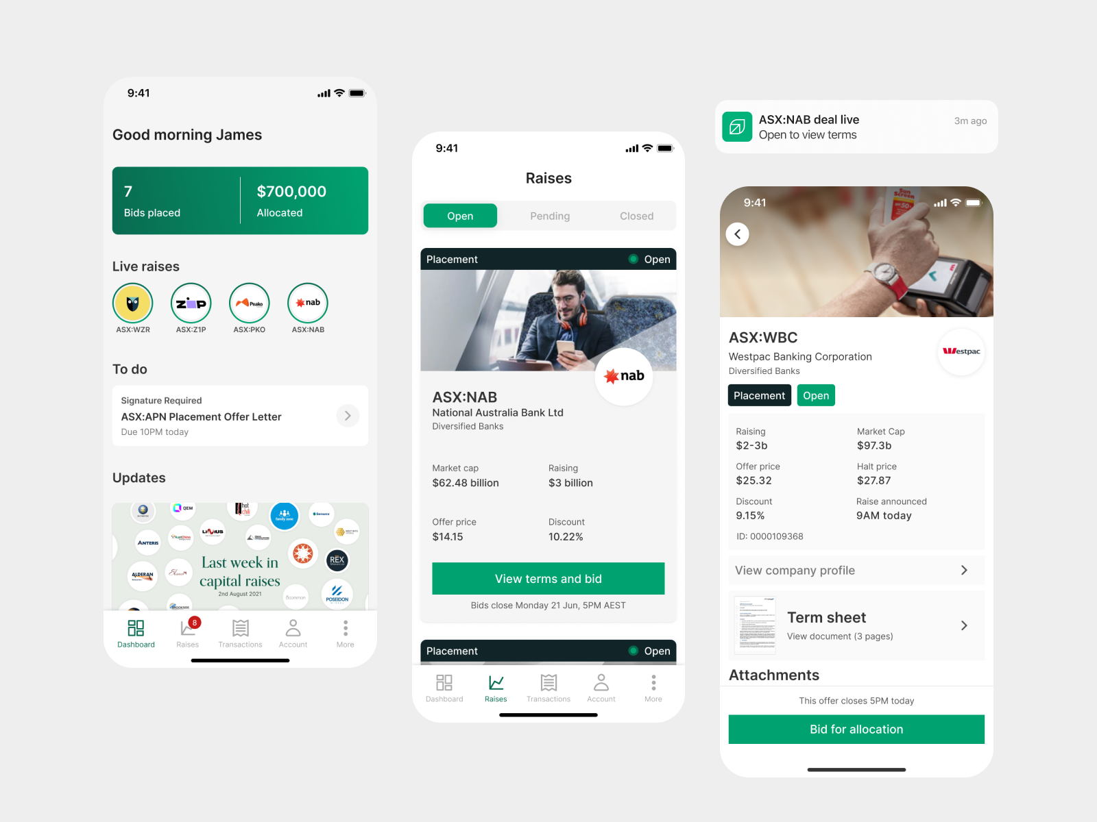
Overview
Fresh Equities is a startup that provides institutions, family offices and high net worth individuals access to investment opportunities in ASX Listed companies raising capital. I joined in Jan 2020 as a sole designer on the team and established and led the design practice there for close to two years. My involvement spanned from User Experience Design, Service Design and User Interface design over the Web Application, Internal admin application, and Mobile Application.
The Product
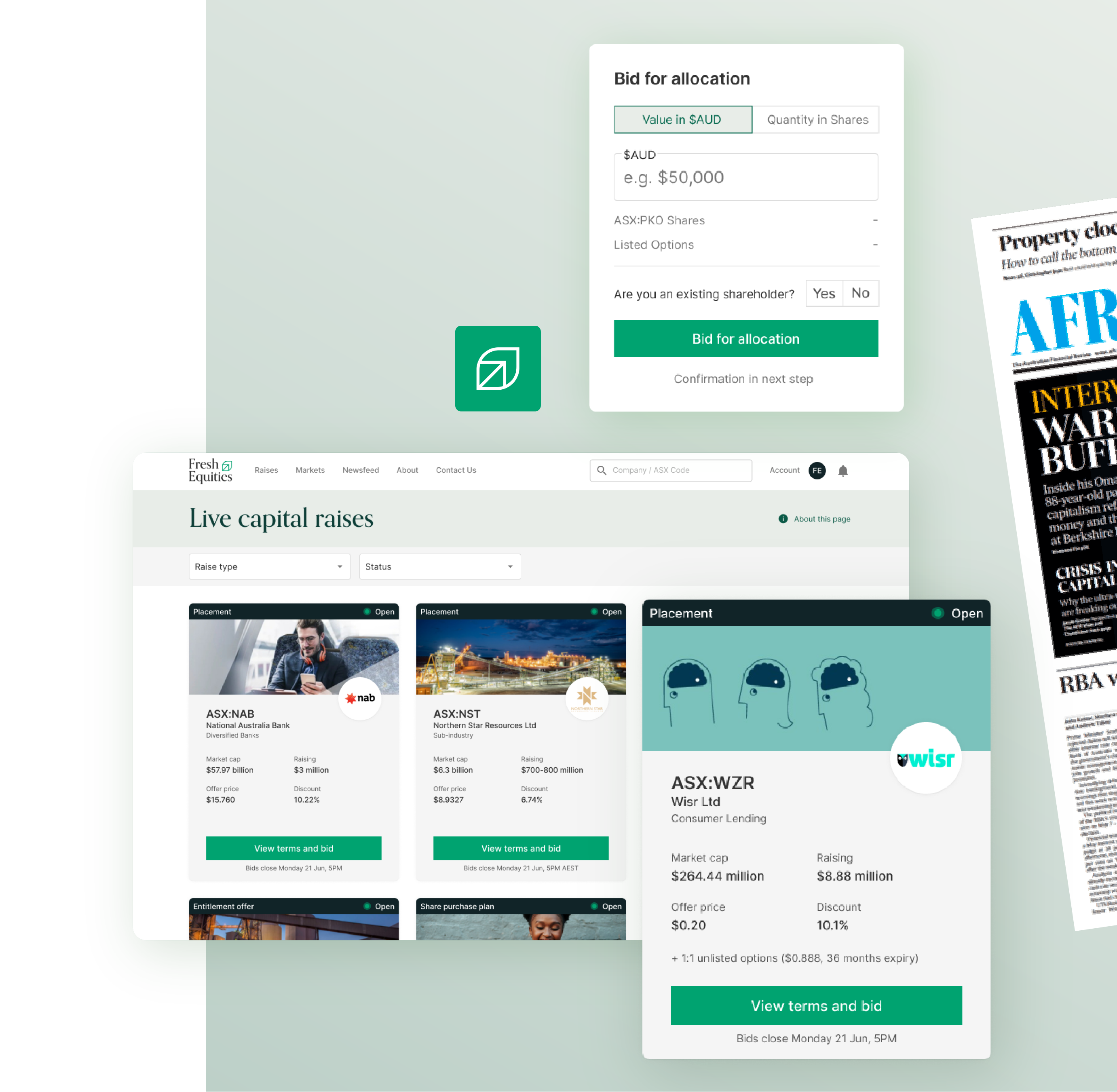
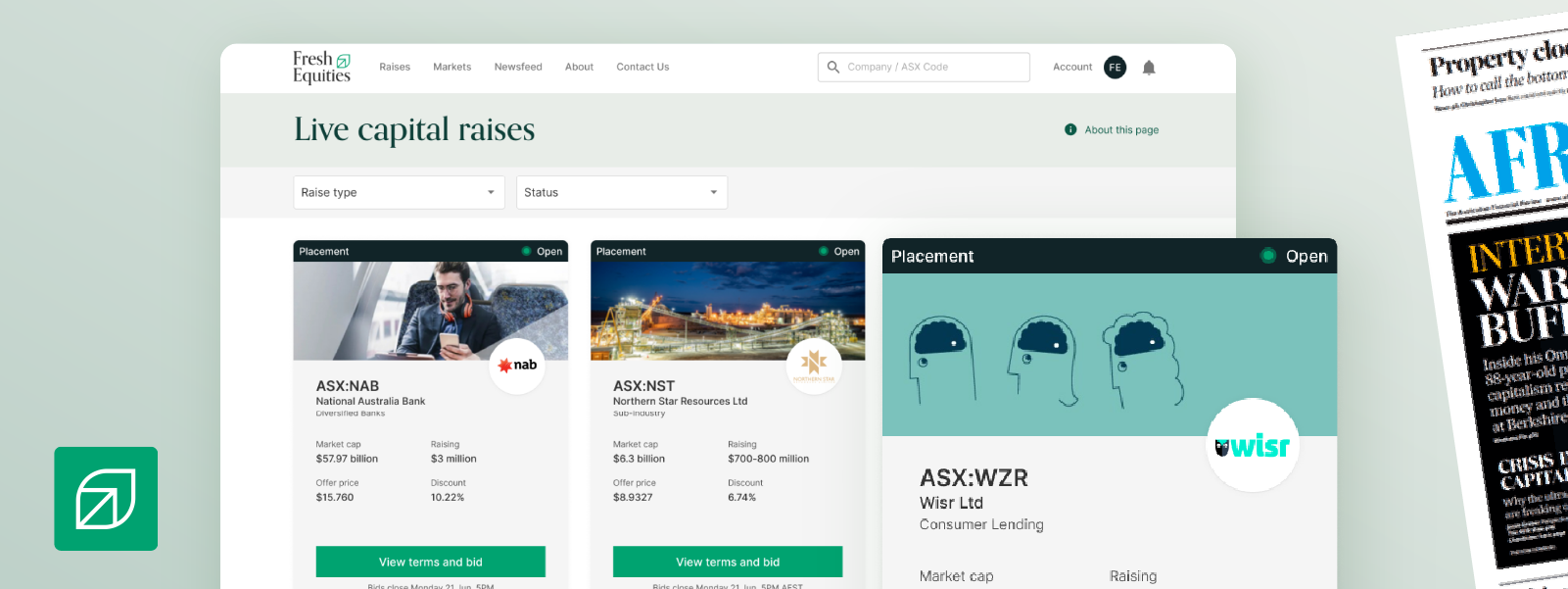
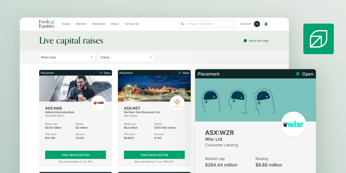
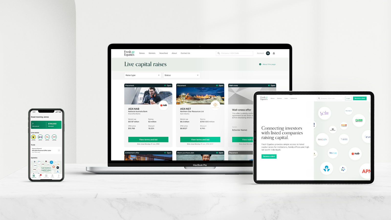
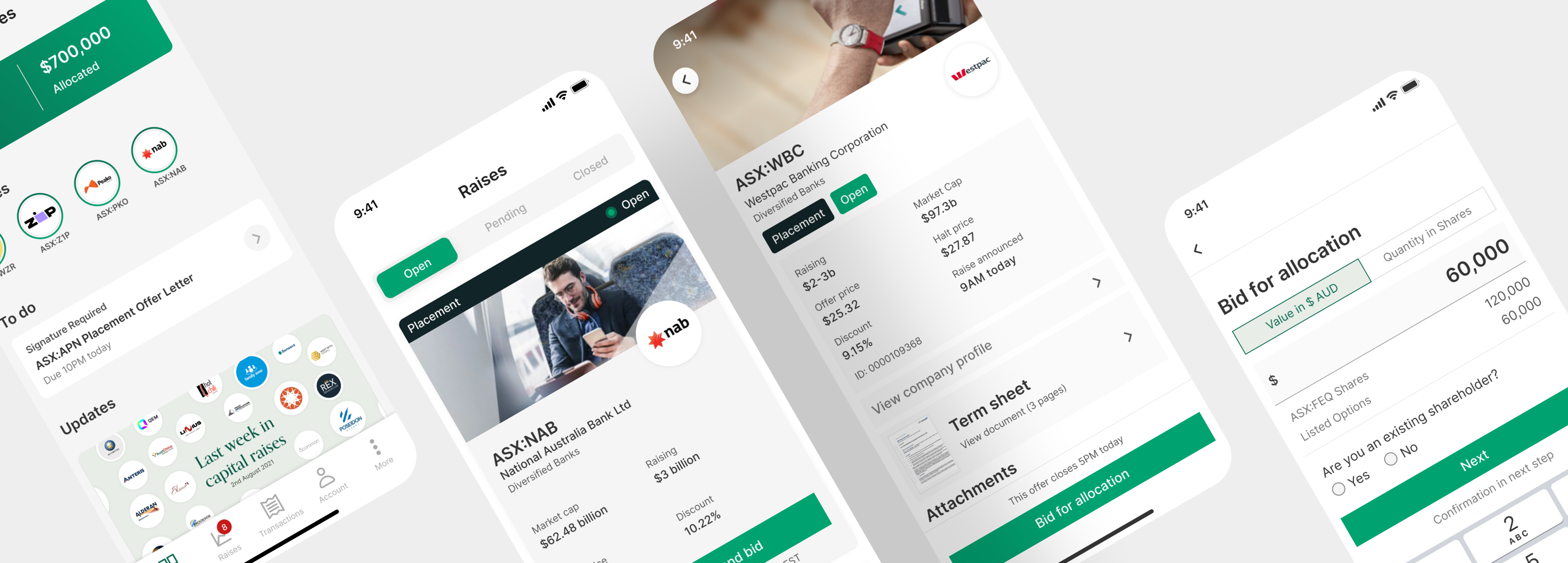
Fresh Equities is a SaaS platform that runs as an intermediary between companies and investors by highlighting Live Capital Raises to investors through a smooth and seamless digital experience in making investments in wholesale quantities. This allows ASX Listed companies access to trusted capital through a vetted list of investors, and provides investors unprecedented access to deal flow. Fresh Equities is the first digital solution to allow investors to invest in ASX Listed Capital raises through the convenience of a digital platform, available on iOS, Android, and through a browser based web-app.
The problem space
Deal flow for capital raises are still being conducted through brokerage firms with limited access to a select group of clients. This means that brokers had to go through a manual process of calling each investor to inform them of new capital raises available, thus extending the timeline for a company to secure capital.
We found that there was a clear demand for a digital solution that allowed an investor to take part in these investments in a much more convenient way, that also provided them with an unbiased take on these investment opportunities.
The Process
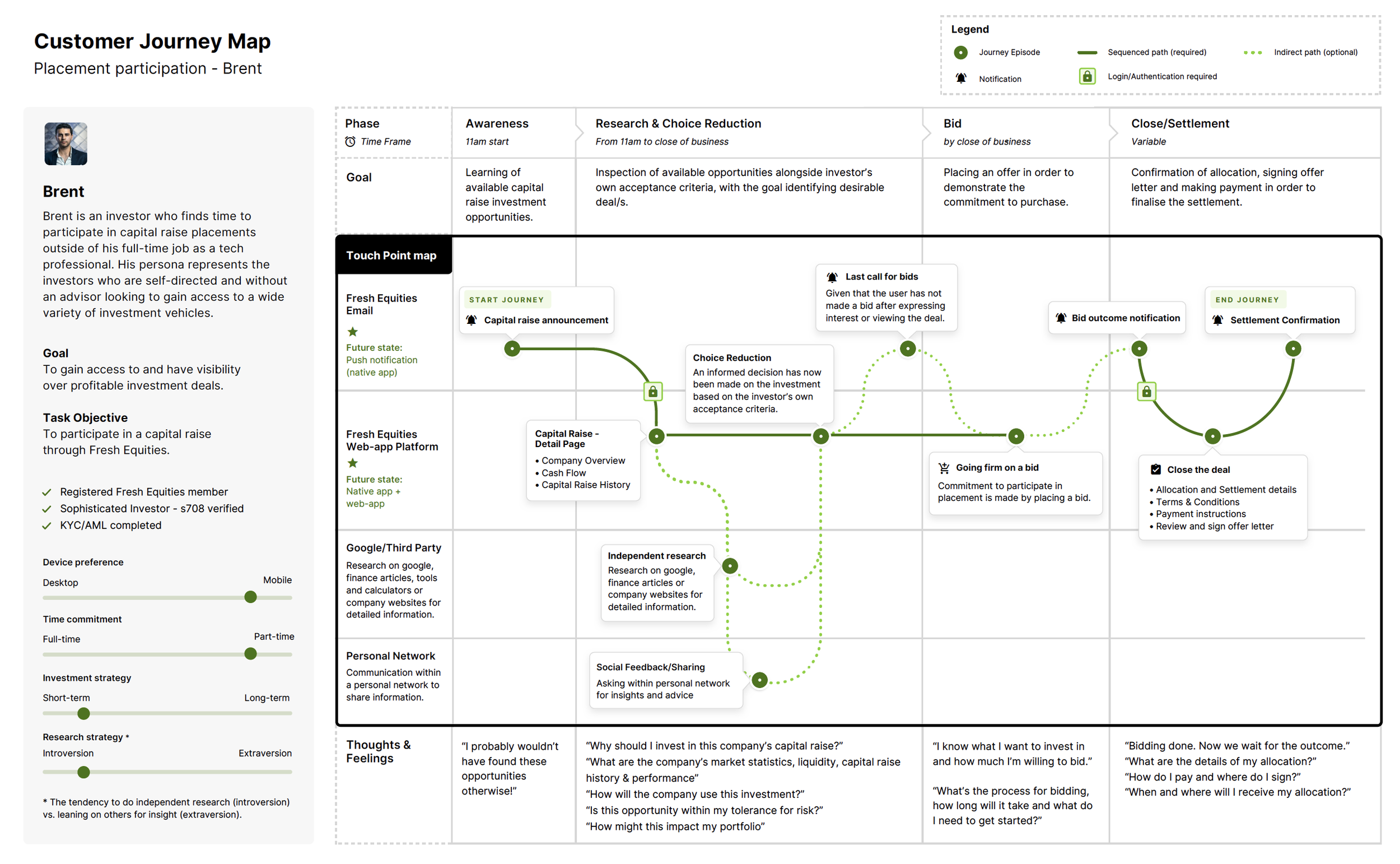
We set out to learn about user’s behaviours and opinions on participating in capital raises. We spoke to a range of highly experienced investors who used the platform regularly, those who were new to investing in capital raises, and to those who could qualify to participate in capital raises.
We learned that many investors who are qualified to participate in capital raises were unaware of the opportunities available. Investors cited frustrations with dozens of forms just to get started. Of those who are actively participating in raises through brokers, they wanted quick and easy access to allocation on raises, whilst keeping abreast of the latest news and and impartial view of a company’s fundamentals.
Increasing awareness
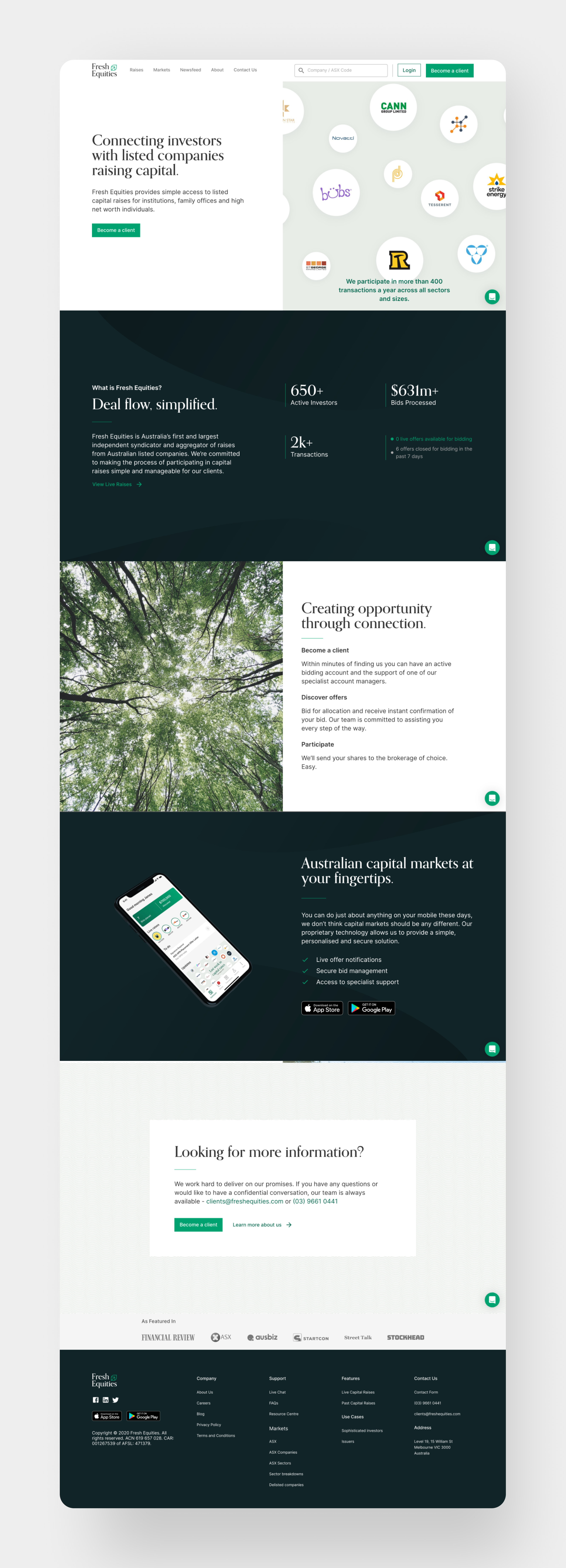
Being the first digital solution for this way of investing meant work had to be done to increase awareness of our product. Our approach was centered around working on a brand look and feel which would resonate with our users, and bring deal flow and abundance up front and center.
Alongside the marketing and leadership team, through rapid sprints of exploration and prototyping we were able to highlight the elements which could evoke the same sense of sophistication and optimism towards wealth creation that we all loved.
The result of this synthesis led to a few concepts and proposed a new brand which included a new logo, colour scheme, and visual UI. Working in close collaboration with the engineering team in quick iterative cycles, we were able to go from zero to the launch of a new visual brand in less than three months.
Smoother customer onboarding
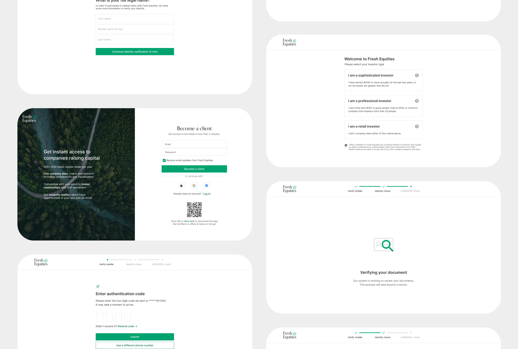
To see a deal on the platform, Fresh Equities needs to verify an investor's ID and investor qualification (s708 certificate). This led to a fair amount of drop-off in the onboarding funnel.
Customer interviews and exploratory research findings suggested that most new investors just wanted to see the deal first, before committing to a lengthy signup process. Problems with the onboarding process became clear to us, after observing user sessions to see where they would drop off. Investors were dropping off after being prompted to upload their s708 certificate. Furthermore, Once investors had dropped off the onboarding flow it was not clear what they needed to do next in order to complete their user profile to see deals.
Supported by our exploratory research and customer interviews, we moved forward with the approach of making the investor qualification process easier to use, as well as making onboarding tasks simpler to understand if the onboarding flow was disrupted.
The new onboarding process was successful in leading to an increase in the conversion of completed of user profiles from 9% to 18.55%.
